react-bootstrap-plugins
DatePicker
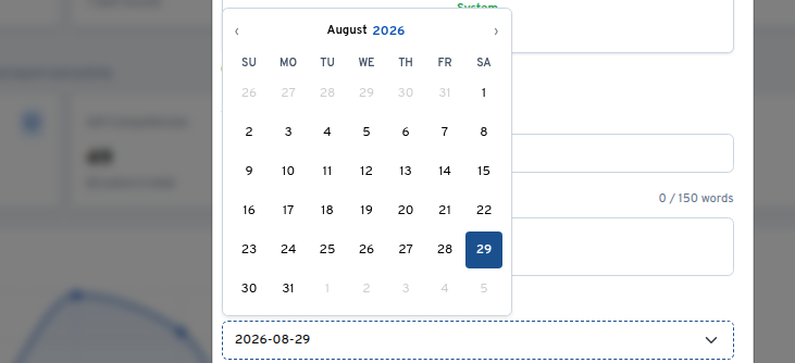
A fully-featured date, time, and datetime picker with Bootstrap 5 styling. Popover is rendered via React Portal — no z-index stacking issues with modals or sidebars.
Import
// Named import from individual entry point (recommended for single-component tree-shaking)
import { DatePicker } from 'react-bootstrap-plugins/DatePicker'

// Barrel import
import { DatePicker } from 'react-bootstrap-plugins'

// Required CSS (import once, anywhere in your app)
import 'react-bootstrap-plugins/css/plugins.css'
Basic Usage
import { useState } from 'react'
import { DatePicker } from 'react-bootstrap-plugins'
import 'react-bootstrap-plugins/css/plugins.css'

function MyForm() {
  const [date, setDate] = useState(null)

  return (
    <DatePicker
      value={date}
      onChange={(e) => setDate(e.target.value)}
      placeholderText="Pick a date"
    />
  )
}
Props
| Prop | Type | Default | Description |
|---|---|---|---|
mode |
'date' | 'time' | 'datetime' |
'date' |
Picker mode |
calendar |
boolean |
false |
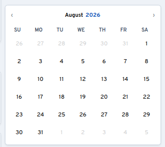
When true, renders the calendar inline without an input field or time picker. Ideal for embedding a date picker directly in a form or dashboard. |
value |
Date | string | null |
— | Currently selected value |
selected |
Date | null |
— | Alias for value |
onChange |
(e) => void |
— | Synthetic event; e.target.value is formatted string, e.target.name is the input name |
dateFormat |
string |
— | Custom format. Tokens: yyyy, MM, dd, hh, mm, aa |
placeholderText |
string |
Auto | Placeholder when empty |
size |
'sm' | 'lg' |
— | Bootstrap input size variant |
isClearable |
boolean |
false |
Show clear button |
disabled |
boolean |
false |
Disable the input |
minDate |
Date | string | number |
— | Earliest selectable date. Accepts the same flexible inputs as value — e.g. another DatePicker’s formatted onChange string |
maxDate |
Date | string | number |
— | Latest selectable date. Accepts the same flexible inputs as value |
timeIntervals |
number |
5 |
Minute step in time picker |
timezone |
string |
'Kampala' |
Timezone label |
className |
string |
— | Additional CSS classes on the input |
id |
string |
— | Input element ID |
name |
string |
— | Input name attribute — surfaces as e.target.name in onChange |
Examples
Date mode (default)
<DatePicker
  name="dob"
  value={birthDate}
  onChange={(e) => setBirthDate(e.target.value)}
  maxDate={new Date()}
  isClearable
/>
// e.target.value → "2026-06-29"
// e.target.name  → "dob"
Time mode
<DatePicker
  mode="time"
  value={startTime}
  onChange={(e) => setStartTime(e.target.value)}
  timeIntervals={15}
/>
// e.target.value → "02:30 PM"
Datetime mode
<DatePicker
  mode="datetime"
  value={appointmentDateTime}
  onChange={(e) => setAppointmentDateTime(e.target.value)}
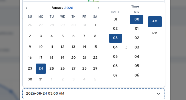
  dateFormat="dd/MM/yyyy hh:mm aa"
/>
// e.target.value → "29/06/2026 02:30 PM"
Inline Calendar mode
When calendar is true, the picker renders as an inline calendar card — no input field, no popover, no time picker. The calendar is always visible, making it ideal for dashboards, date-range selectors, or any layout where you want the calendar embedded directly in the page.
<DatePicker
  calendar
  name="eventDate"
  value={eventDate}
  onChange={(e) => setEventDate(e.target.value)}
  minDate={new Date()}
/>
// e.target.value → "2026-07-22"
// Renders as an inline card with the full calendar grid
The component applies the datepicker-calendar-inline CSS class alongside card, border, and shadow-sm for the wrapper. Any className you pass is merged onto the wrapper div.
Linked pickers (start date bounds end date)
minDate/maxDate accept the formatted string another picker emits, so linking two pickers needs no conversion:
const [startDate, setStartDate] = useState(null)
const [endDate, setEndDate] = useState(null)

<DatePicker
  name="startDate"
  value={startDate}
  onChange={(e) => setStartDate(e.target.value)}
/>
<DatePicker
  name="endDate"
  value={endDate}
  onChange={(e) => setEndDate(e.target.value)}
  minDate={startDate}   // "2026-07-15" string works directly
/>
With Bootstrap form layout
<div className="mb-3">
  <label htmlFor="eventDate" className="form-label">Event Date</label>
  <DatePicker
    id="eventDate"
    name="eventDate"
    value={eventDate}
    onChange={(e) => setEventDate(e.target.value)}
    minDate={new Date()}
    className="form-control-lg"
  />
</div>
CSS Import
DatePicker requires a small CSS file for its popover calendar layout. Import it once in your app:
// Recommended — uses the package exports map
import 'react-bootstrap-plugins/css/plugins.css'
For troubleshooting CSS import issues, see the main README.
Dark Mode
The DatePicker respects Bootstrap 5’s dark mode. Set data-bs-theme="dark" on any parent element and the popover calendar adapts automatically.
Bundle Size
~5.5 KB (min+gzip, including CSS).
See Also
- SearchSelect — Filterable, searchable select dropdown
- Label — Bootstrap-styled form label with required indicator
- Main README — Package overview, installation, and general info